
Thursday, 7 May 2015
Rotoscoping
Creating Typeface


When first making my typeface i got up random artistic images and started just experimenting in my sketchbook, with random typeface drawn everywhere on a page. After i chose one to carry on i designed the whole alphabet of it, which was inspired by a spiralled staircase.

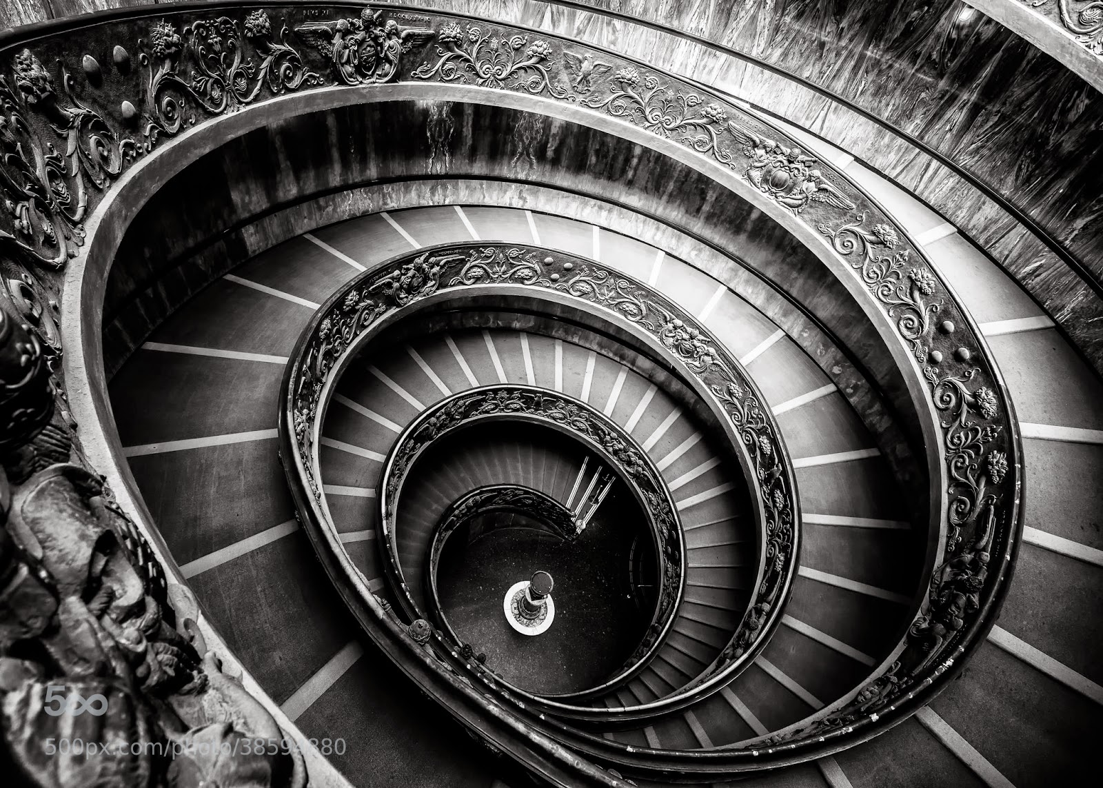
When creating a typeface i experimented with many designs. I looked at different images that i could create a typeface of, but at the end i went with a spiral staircase, which i thought was effective for an typeface.
After Effects 4 - Kinetic Typography
Kinetic Typography from Aadam Lambat on Vimeo.
For our final After Effect lesson we had to create kinetic typography, which consisted an famous quote. i chose the famous mohammed ali quote during his boxing career.
Sunday, 26 April 2015
Inspiration


General research I conducted throughout this project by surfing on the internet such as the images I found above gave me inspiration for my designs. Looking at the images from my research intrigued me and inspired me on how they made these kind of designs. Above are just some images on what I found, which I could incorporate into my work. These inspirations are like a starting point to what I could design and develop my final idea into. As it inspires me to incorporate these designs into my idea as well as develop it further and unique and one of my own.
Here is an example of one of my piece of work that i created on Photoshop, following the general research I found. I used the concept of nature such as leaves in order to create an effect of a persons face. I think this kind of design and idea is really effective and the overall design just blows me away of how good the design looks.

Toyota Vios Commercial Advertisement
This advert from Toyota is really stands out due to the fact it being different to all others ones created by other car brands. The way they have incorporated the text into the video as well as it being a video of the car being modern. As it shows in this modern day life of what features people are looking for in a car. Not only it being advertised by a famous music band I think it was a good way how they used the band for the commercial as it attracts younger audience and more develops interest to the car being advertised.
The way the text fits in with the whole video and how it leads on to another part of video is clever as it all fits in to the background design, each part of the video is well thought out as it incorporates both typography and visual stimulus which makes the car stand out.
Overall the advert from Toyota is unique and the actual deign aspect of it is something which I inspire to do with a few more tutorials on Adobe After Effects.
Experiment on Kinetic Typography
Here is my Video using Adobe After Effects, experimenting on kinetic typography, However in the future I could add a background video with text on it like the toyota advert above.
Global-warmingill from Aadam Lambat on Vimeo.
Calligraphy
Typography work of designers and artists really intrigued me, however as I was researching different typography designs I came across calligraphy work and different calligraphy writing, which made me further research more upon calligraphy and how it is done. I found that calligraphy is elegant and fancy. It gives it this feel, because of the
elegant lines and strokes, which have been created using a calligraphy
pen. As it looks very delicate it gives the illusion that is very
simple.
Calligraphy is a visual art related to writing. It is the design and execution of lettering with a broad tip instrument, dip pen, or brush, among other writing instruments.
Arabic Calligraphy is really interesting and i have been looking at arabic calligraphy that has been produced already. Mastering such skill is difficult as it comes with years of practice. Most of this calligraphy is written in the Holy Quraan, as it is witten in arabic calligraphy. Arabic calligraphy interests me however it can be quite time consuming, but the final outcome is amazing and looks really effective on designs. Arabic calligraphy can be designed in many shapes, foe e.g. animals, shape of a heart. Here are examples of arabic calligraphy:


I looked at some calligraphy artists and came across an artist called:
John Stevens
John Stevens is an internationally acclaimed calligrapher & illustrator, raising letterforms to the realm of imagery. Observing the excellence of the 2000 year history of Western Calligraphy, he embraces both tradition/craft, as well as expressive and experimental. Whether using a brush, quill, handmade paper, vellum or drawing a letter form in vector, he feels there are craft and high standards to be maintained and constantly sharpened or improved.

I used an ink pen and pencil in order to create these calligraphy words. I used free hand drawing as this as the best idea and more flow into the calligraphy in my sketchbook. However, it is not a calligraphy pen that I was using as I think that would have a better flow of the calligraphy writing and see how it feels.
I got hold of a wooden calligraphy pen the next day, with some ink, which I could experiment on a piece of paper. As I was a beginner of calligraphy writing, I thought I would just write my name in arabic with the calligraphic pen, as a novice it would be harder for me to design arabic lettering in different shapes.


 Here is my experimentation of my name in arabic with calligraphy pen writing. My favourite is the arabic writing in the middle of the page as the stroke of the lines and the design of the calligraphy looks effective.
Calligraphy is a visual art related to writing. It is the design and execution of lettering with a broad tip instrument, dip pen, or brush, among other writing instruments.
Arabic Calligraphy is really interesting and i have been looking at arabic calligraphy that has been produced already. Mastering such skill is difficult as it comes with years of practice. Most of this calligraphy is written in the Holy Quraan, as it is witten in arabic calligraphy. Arabic calligraphy interests me however it can be quite time consuming, but the final outcome is amazing and looks really effective on designs. Arabic calligraphy can be designed in many shapes, foe e.g. animals, shape of a heart. Here are examples of arabic calligraphy:
I looked at some calligraphy artists and came across an artist called:
John Stevens
John Stevens is an internationally acclaimed calligrapher & illustrator, raising letterforms to the realm of imagery. Observing the excellence of the 2000 year history of Western Calligraphy, he embraces both tradition/craft, as well as expressive and experimental. Whether using a brush, quill, handmade paper, vellum or drawing a letter form in vector, he feels there are craft and high standards to be maintained and constantly sharpened or improved.
Calligraphy Experiment
After looking at calligraphy I had the inspiration to have ago of it myself. I tried Arabic, as well as simple calligraphy, in order to have the feel of what outcome is. Here is my calligraphy work:I used an ink pen and pencil in order to create these calligraphy words. I used free hand drawing as this as the best idea and more flow into the calligraphy in my sketchbook. However, it is not a calligraphy pen that I was using as I think that would have a better flow of the calligraphy writing and see how it feels.
I got hold of a wooden calligraphy pen the next day, with some ink, which I could experiment on a piece of paper. As I was a beginner of calligraphy writing, I thought I would just write my name in arabic with the calligraphic pen, as a novice it would be harder for me to design arabic lettering in different shapes.
Colour Psychology

Colour psychology was one of the topics that we studied in one of our lecture lessons. This inspired me to look further and research more on this topic. It intrigued me and influenced my work on how the use of colour's in graphic design can influence our thoughts and action on the design created.
Each colour has its own meaning here is what I think of what each colour represents:
| RED Positive: Physical courage, strength, warmth, energy, basic survival, 'fight or flight', stimulation, masculinity, excitement. Negative: Defiance, aggression, visual impact, strain, danger. Being the longest wavelength, red is a powerful colour. Although not technically the most visible, it has the property of appearing to be nearer than it is and therefore it grabs our attention first. Hence its effectiveness in traffic lights the world over. Its effect is physical; it stimulates us and raises the pulse rate, giving the impression that time is passing faster than it is. It relates to the masculine principle and can activate the "fight or flight" instinct. Red is strong, and very basic. Pure red is the simplest colour, with no subtlety. It is stimulating and lively, very friendly. At the same time, it can be perceived as demanding and aggressive. |
| BLUE Positive: Intelligence, communication, trust, efficiency, serenity, duty, logic, coolness, reflection, calm. Negative: Coldness, aloofness, lack of emotion, unfriendliness. Blue is the colour of the mind and is essentially soothing; it affects us mentally, rather than the physical reaction we have to red. Strong blues will stimulate clear thought and lighter, soft blues will calm the mind and aid concentration. Consequently it is serene and mentally calming. It is the colour of clear communication. Blue objects do not appear to be as close to us as red ones. Time and again in research, blue is the world's favourite colour. However, it can be perceived as cold, unemotional and unfriendly. |
| YELLOW Positive: Optimism, confidence, self-esteem, emotional strength, friendliness, creativity. Negative: Irrationality, fear, emotional fragility, depression, anxiety, suicide. The yellow wavelength is relatively long and essentially stimulating. In this case the stimulus is emotional, therefore yellow is the strongest colour, psychologically. The right yellow will lift our spirits and our self-esteem; it is the colour of confidence and optimism. Too much of it, or the wrong tone in relation to the other tones in a colour scheme, can cause self-esteem to plummet, giving rise to fear and anxiety. |
| GREEN Positive: Harmony, balance, refreshment, universal love, rest, restoration, reassurance, environmental awareness, equilibrium, peace. Negative: Boredom, blandness, enervation. Green strikes the eye in such a way as to require no adjustment whatever and is, therefore, restful. When the world about us contains plenty of green, this indicates the presence of water, and little danger of famine, so we are reassured by green, on a primitive level. Negatively, it can indicate stagnation and, incorrectly used, will be perceived as being too bland. |
| VIOLET Positive: Spiritual awareness, containment, vision, luxury, authenticity, truth, quality. Negative: Introversion, suppression, inferiority. The shortest wavelength is violet, often described as purple. It takes awareness to a higher level of thought, even into the realms of spiritual values. It highly encourages deep contemplation, or meditation. It has associations with royalty and usually communicates the finest possible quality. Being the last visible wavelength before the ultra-violet ray, it has associations with time and space and the cosmos. Excessive use of purple can bring about too much introspection and the wrong tone of it communicates something cheap and nasty, faster than any other colour. |
| ORANGE Positive: Physical comfort, food, warmth, security, sensuality, passion, abundance, fun. Negative: Deprivation, frustration, immaturity. Since it is a combination of red and yellow, orange is stimulating and reaction to it is a combination of the physical and the emotional. This is particularly likely when warm orange is used with black. Equally, too much orange suggests frivolity and a lack of serious intellectual values. |
| PINK Positive: warmth, femininity, love, sexuality, survival of the species. Negative: Inhibition, emotional claustrophobia, emasculation, physical weakness. Being a tint of red, pink also affects us physically, but it soothes, rather than stimulates. Pink is a powerful colour, psychologically. It represents the feminine principle, and survival of the species; it is nurturing and physically soothing. Too much pink is physically draining and can be somewhat emasculating. |
| GREY Positive: Psychological neutrality. Negative: Lack of confidence, dampness, depression, hibernation, lack of energy. Pure grey is the only colour that has no direct psychological properties. It is, however, quite suppressive. A virtual absence of colour is depressing and when the world turns grey we are instinctively conditioned to draw in and prepare for hibernation. Unless the precise tone is right, grey has a dampening effect on other colours used with it. Heavy use of grey usually indicates a lack of confidence and fear of exposure. |
| BLACK Positive: Sophistication, glamour, security, emotional safety, efficiency, substance. Negative: Oppression, coldness, menace, heaviness. Black is all colours, totally absorbed. The psychological implications of that are considerable. It creates protective barriers, as it absorbs all the energy coming towards you, and it enshrouds the personality. Black is essentially an absence of light, since no wavelengths are reflected and it can, therefore be menacing; many people are afraid of the dark. Positively, it communicates absolute clarity, with no fine nuances. It communicates sophistication and uncompromising excellence and it works particularly well with white. Black creates a perception of weight and seriousness. WHITE Positive: Hygiene, sterility, clarity, purity, cleanness, simplicity, sophistication, efficiency. Negative: coldness Just as black is total absorption, so white is total reflection. In effect, it reflects the full force of the spectrum into our eyes. Thus it also creates barriers, but differently from black, and it is often a strain to look at. It communicates, White is purity and, like black, uncompromising; it is clean, hygienic, and sterile. BROWN Positive: Seriousness, warmth, Nature, reliability, support. Negative: Lack of humour, heaviness, lack of sophistication. Brown usually consists of red and yellow, with a large percentage of black. Consequently, it has much of the same seriousness as black, but is warmer and softer. It has elements of the red and yellow properties. Brown has associations with the earth and the natural world. It is a solid, reliable colour and most people find it quietly supportive. |
Subscribe to:
Posts (Atom)