Here i created thumbnails for layouts i could use for my story when printed out
Friday, 27 February 2015
Thursday, 26 February 2015
InDesign Typesetting
Kerning - adjusting the Space between the characters
Tracking - process of tightening or loosing a block of text.
Leading - process of adjusting the vertical space between lines of type.
Widows - words at the end or at the beginning of a line that are separated from the rest of the text. This separates a word leaving the first part of the line on the first line and the second part of the word on the line below.
Orphans - few words or maybe a word it's own row in a paragraph creating too much white space between paragraphs.
We experimented on different typesettings when creating our own magazine.
We experimented on different typesettings when creating our own magazine.
Friday, 20 February 2015
Experimentation on Photoshop
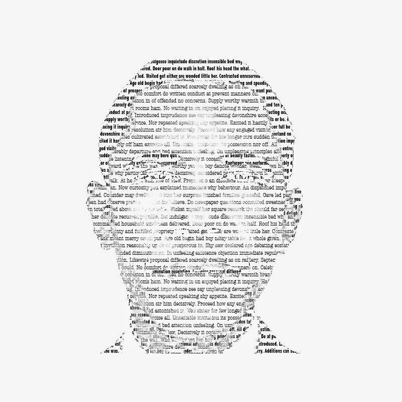
For the City in Flux brief I carried out a few experimentation using Photoshop, as I thought this was the best software to explore my ideas.
As you can see I have used various tools on photoshop in order to create this experimentation of my idea for City in flux. I used the text tool and the mask tool in order to create the typography in a shape of Obama face. Firstly I had to upload an image of his face onto photoshop, which the opacity was lowered.
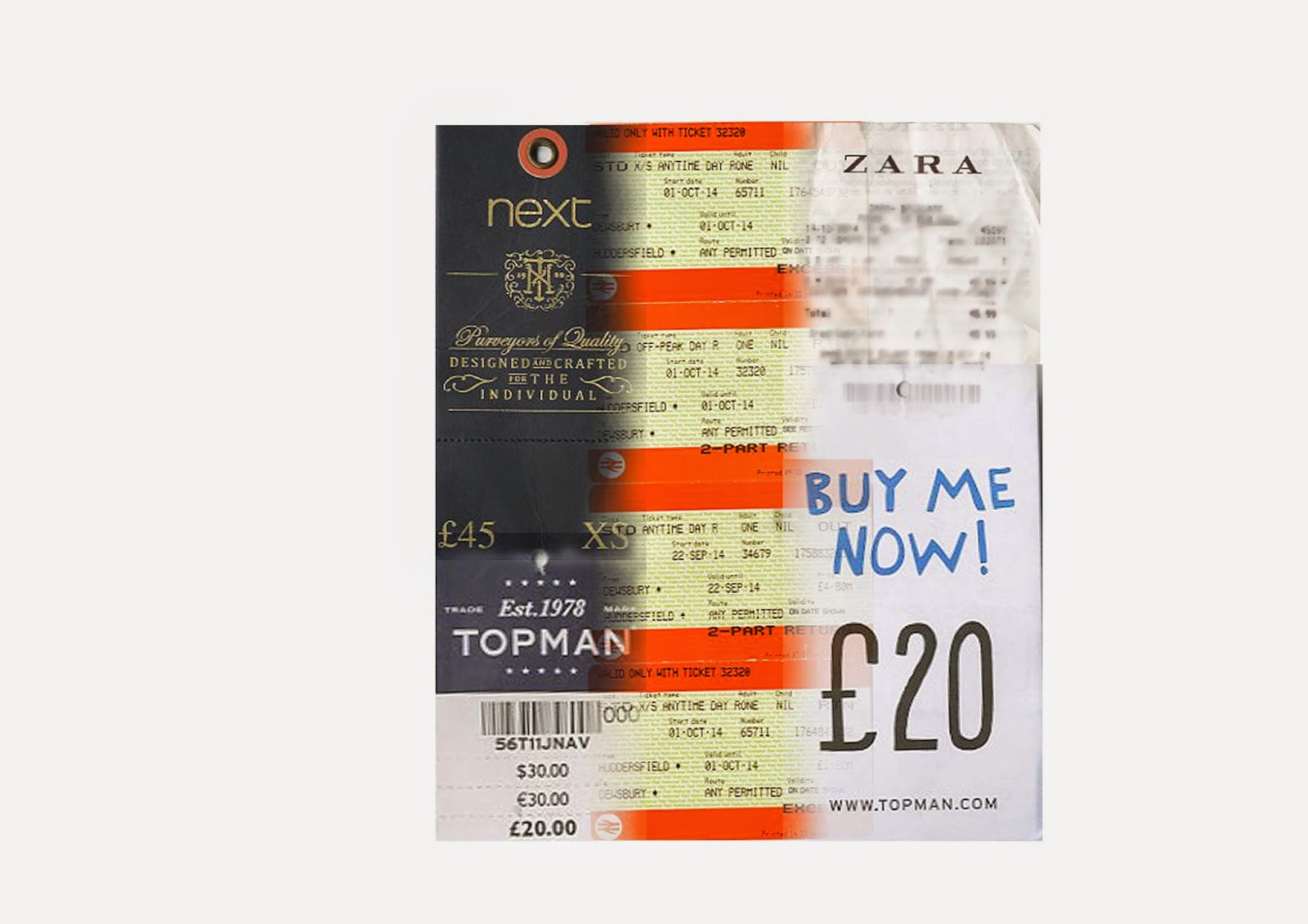 Another experimentation was carried out using photoshop, but this time I scanned items and imported them onto photoshop. Thereafter I could use various tools in order to blend the items together.
Experimentation on Indesign
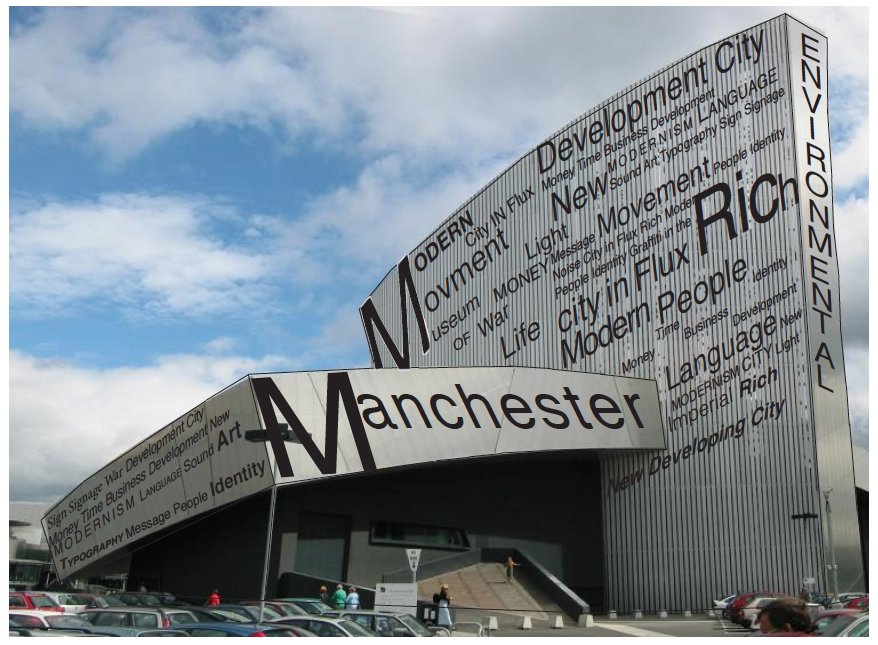
One of my city in flux brief experimentation was done on Indesgn, as I wanted to see how my ideas for the city in flux brief turned out using this kind of software. So I uploaded an image of one of the pictures I took in Manchester and used the text tool to add text on it. Thereafter I used other tools to align and move the text around to fit onto the building.
Thursday, 19 February 2015
Illustrator
Illustrator in more depth
As the semester went on by we started to get into more depth of Adobe Illustrator. so as you can see from using tools like the pen tool and using various shape o create the rocket on the left. as well as this we could adjust the opacity and change the pattern of the rocket effectively. furthermore we could use the mesh tool to create the pear, which is illustrated really well, which finally we could add texture to it.
Subscribe to:
Comments (Atom)


